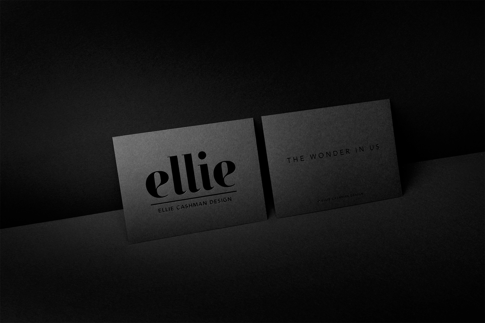
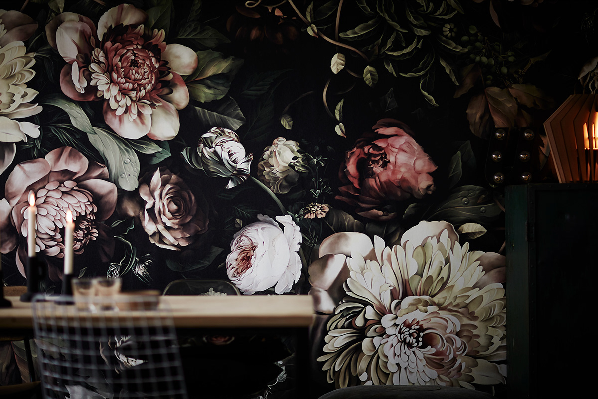
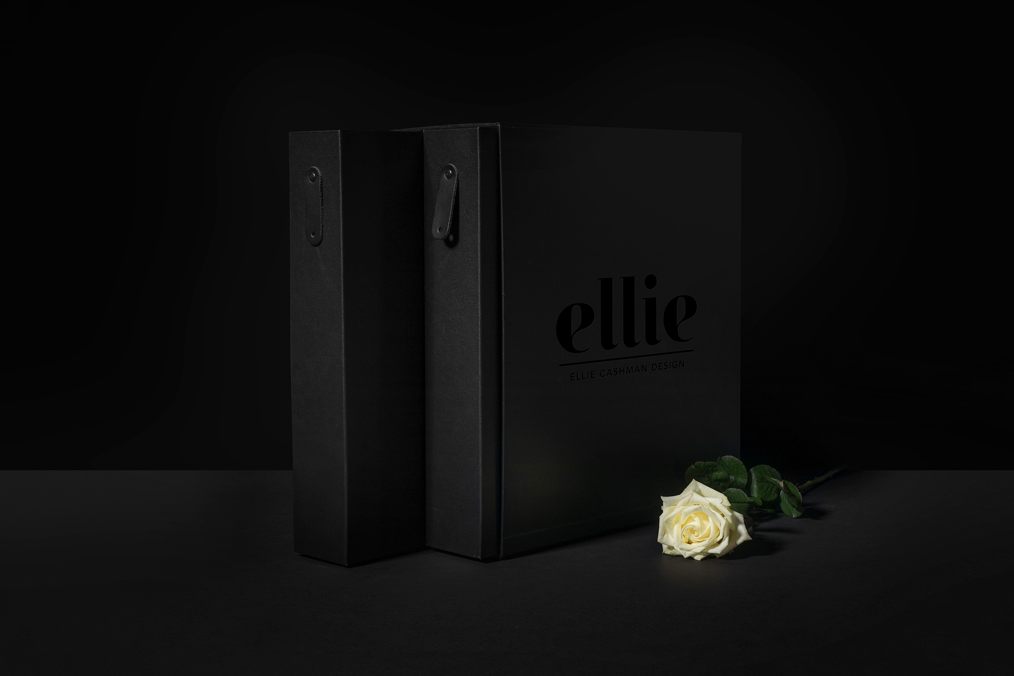
Together with Ellie’s team we developed a brand strategy which formed the foundation of the identity and website, as well as all of the deliverables and packaging. The new identity is personal, feminine and clear cut. A black and pink colour palette emphasises all states of painted flowers, from dark to light, from seed to stalk to bud to full, extravagant bloom.
Being an American artist living in the Netherlands Ellie serves both markets. Today her designs can be found all over the world in the form of wallpapers, cushions, all kinds of fabrics and scarfs. Our challenge lies in how to create a clear identity that represents the brand globally.
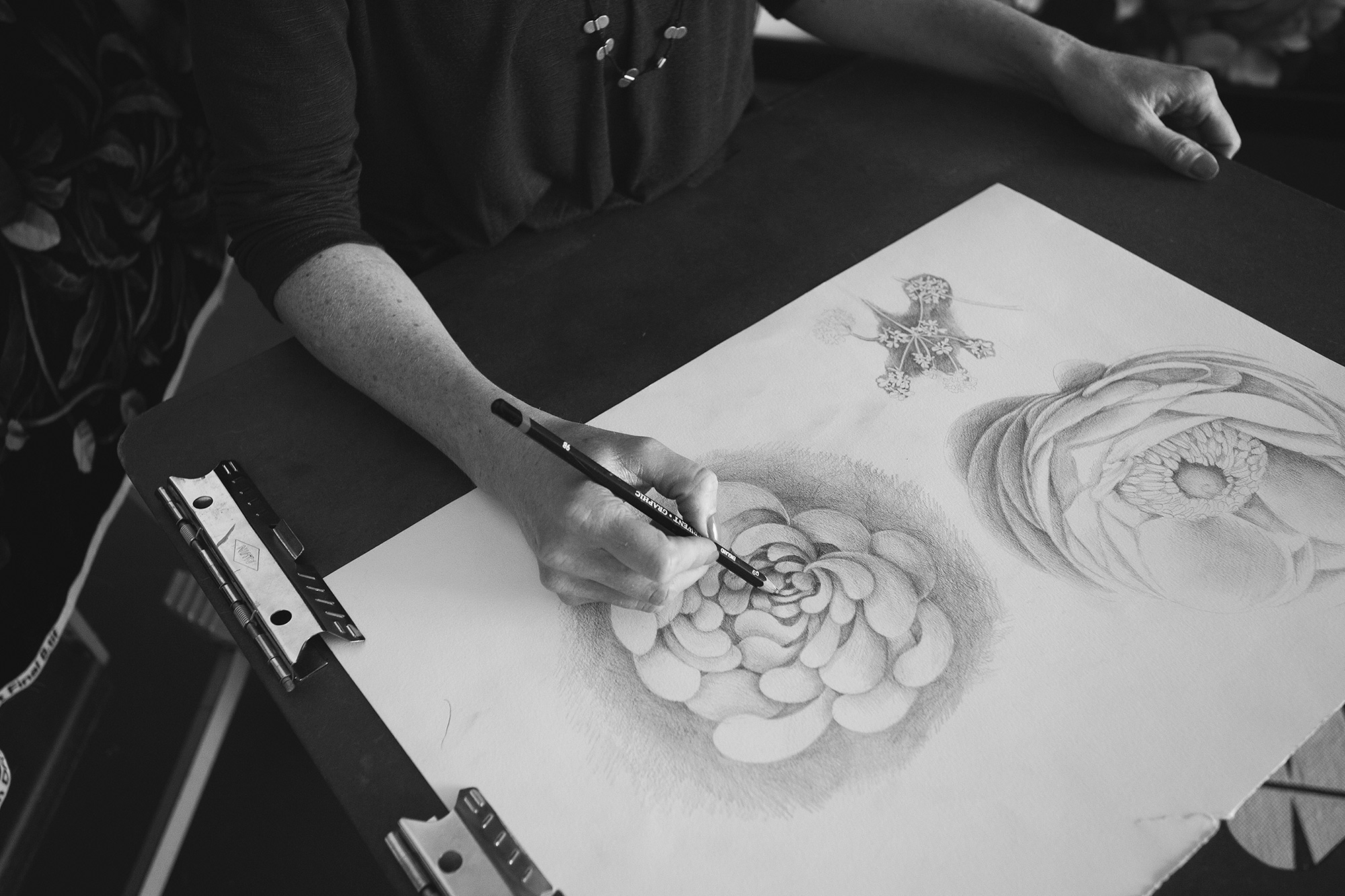
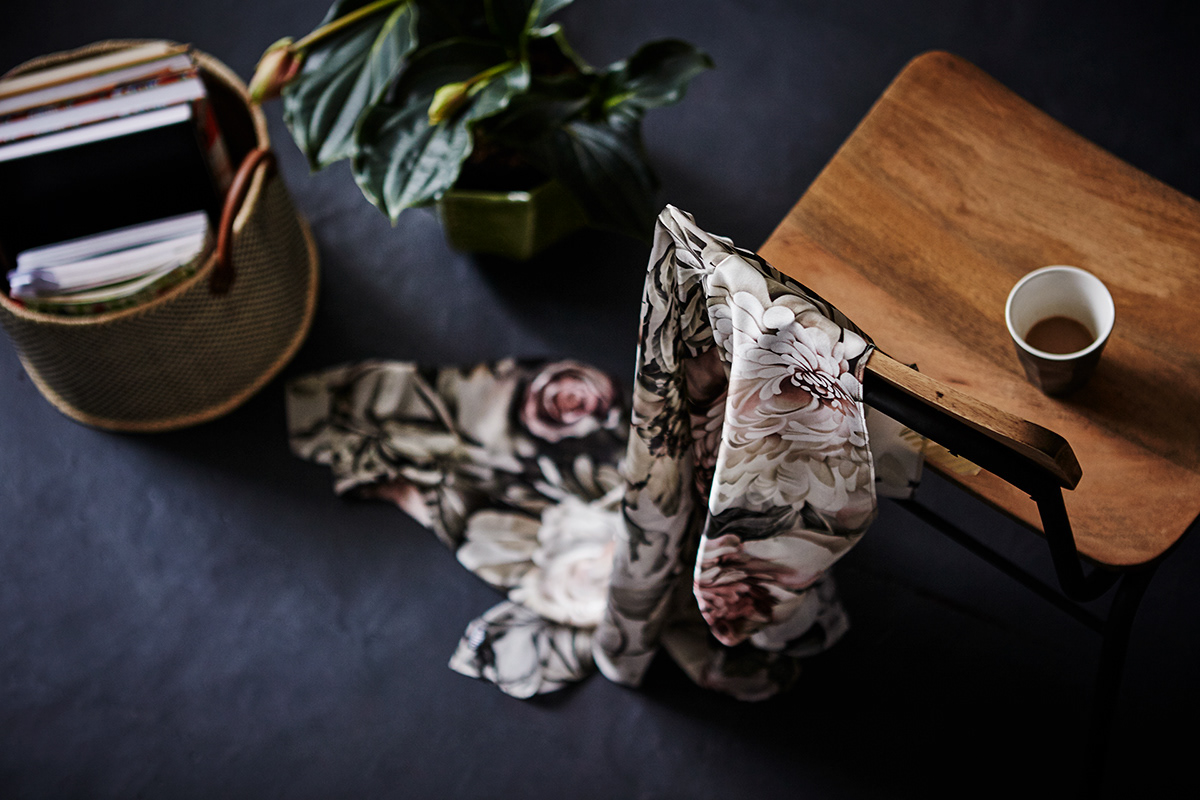
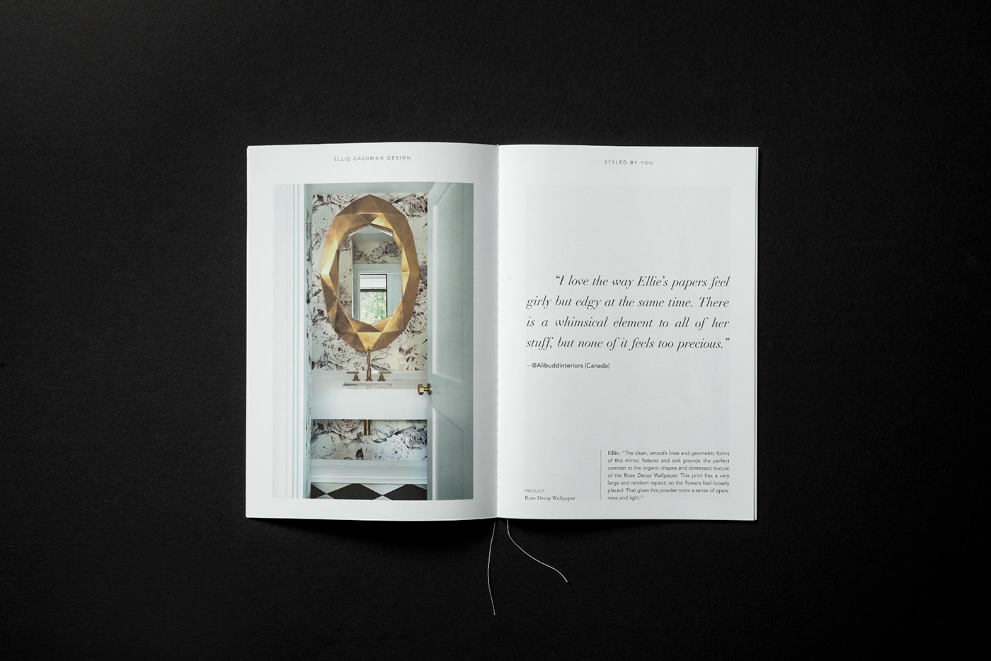
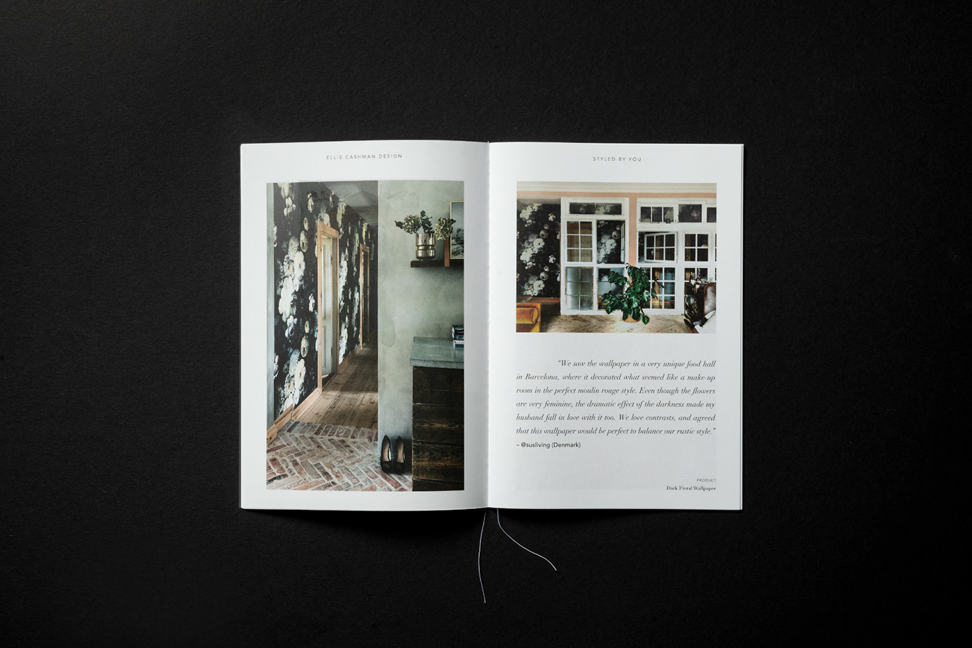
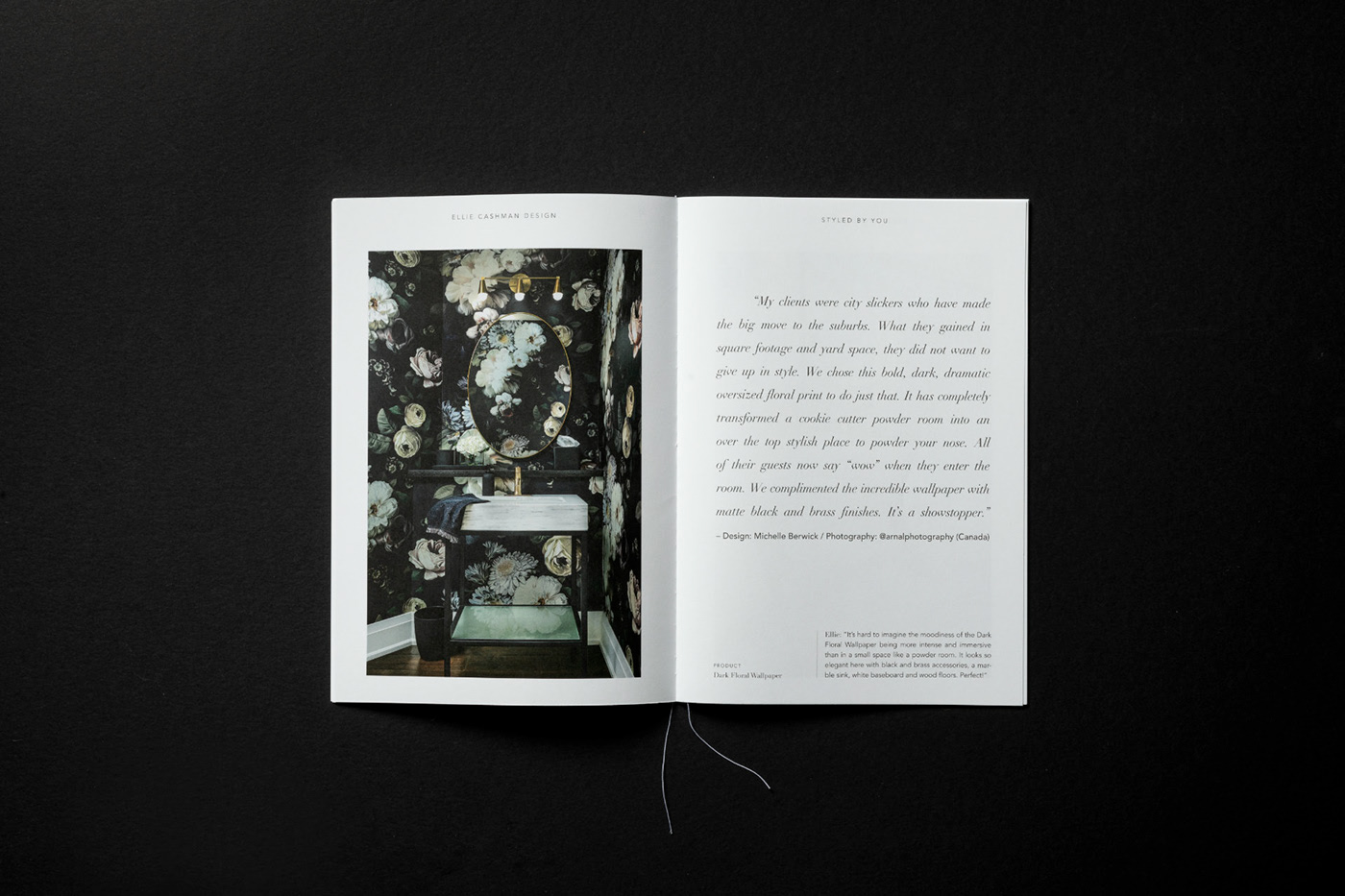
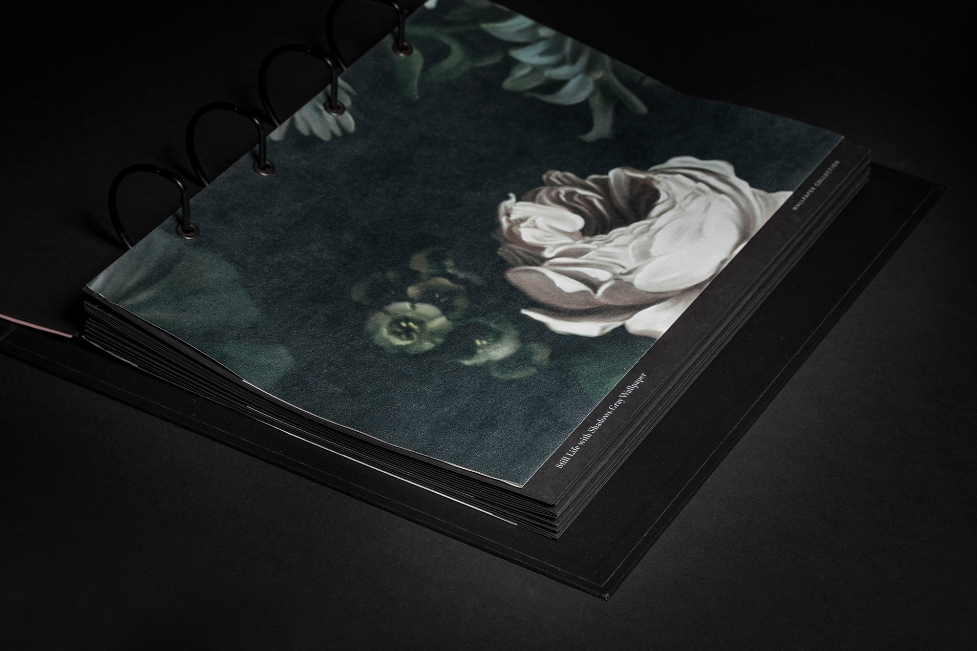
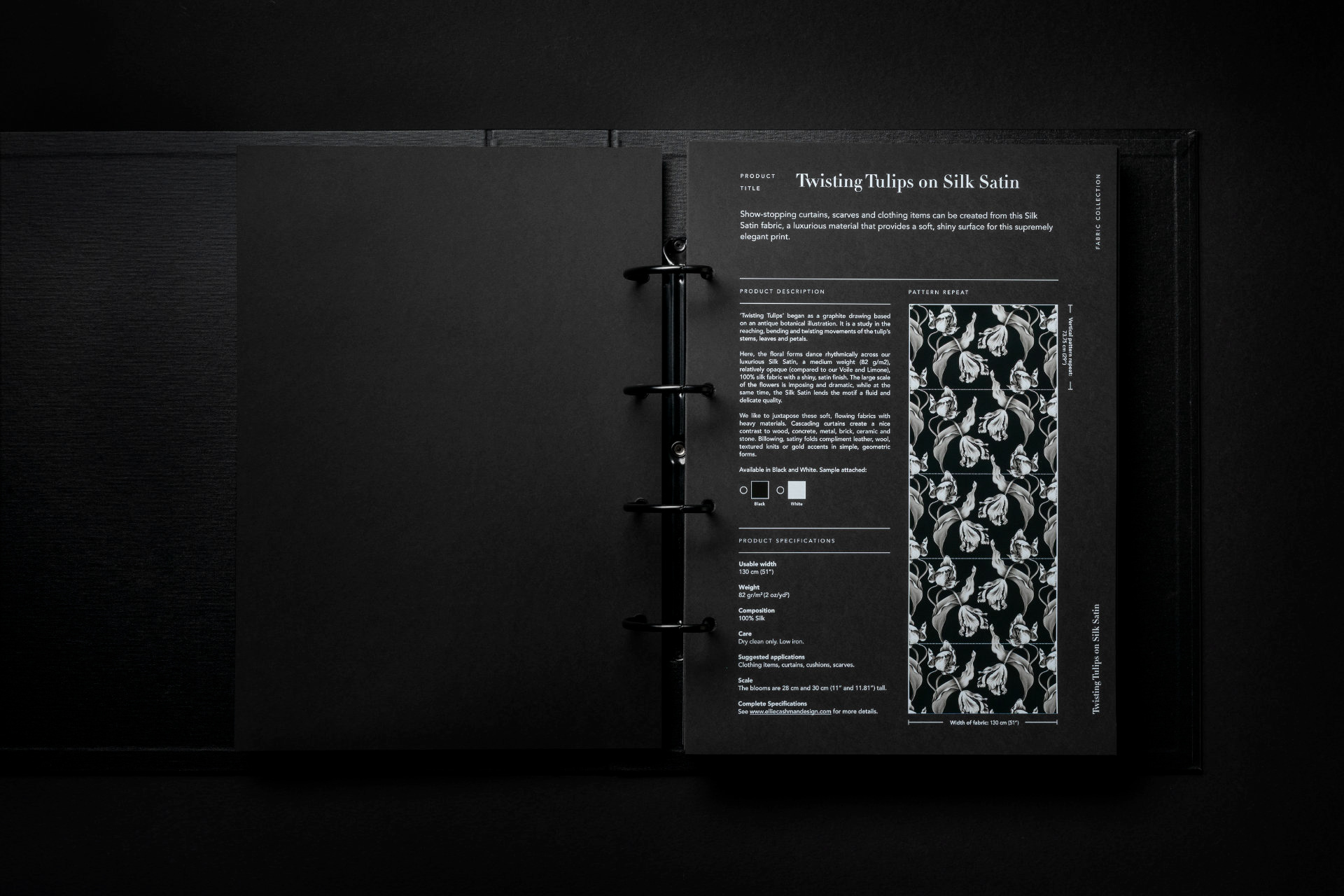
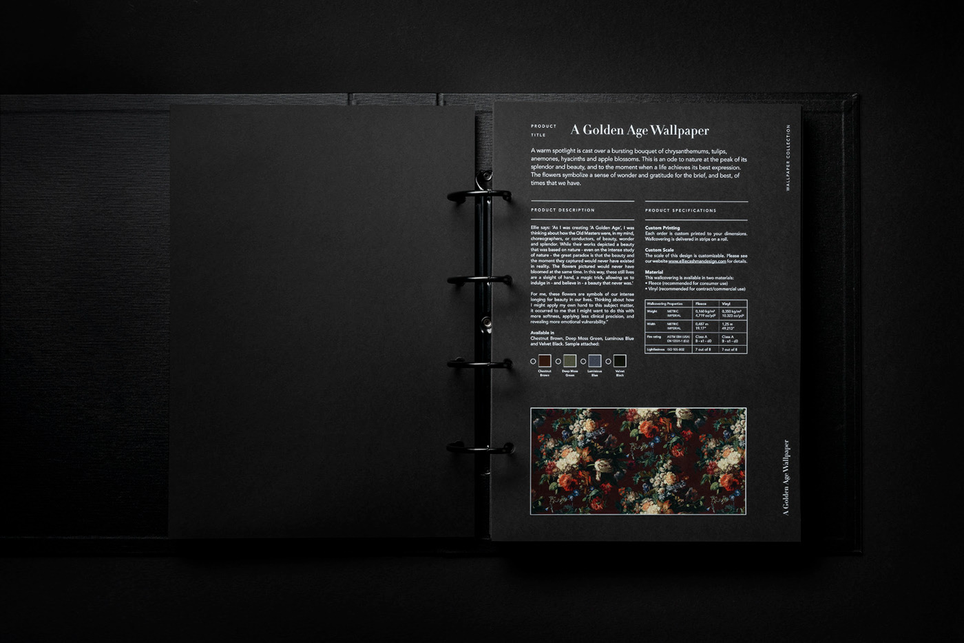
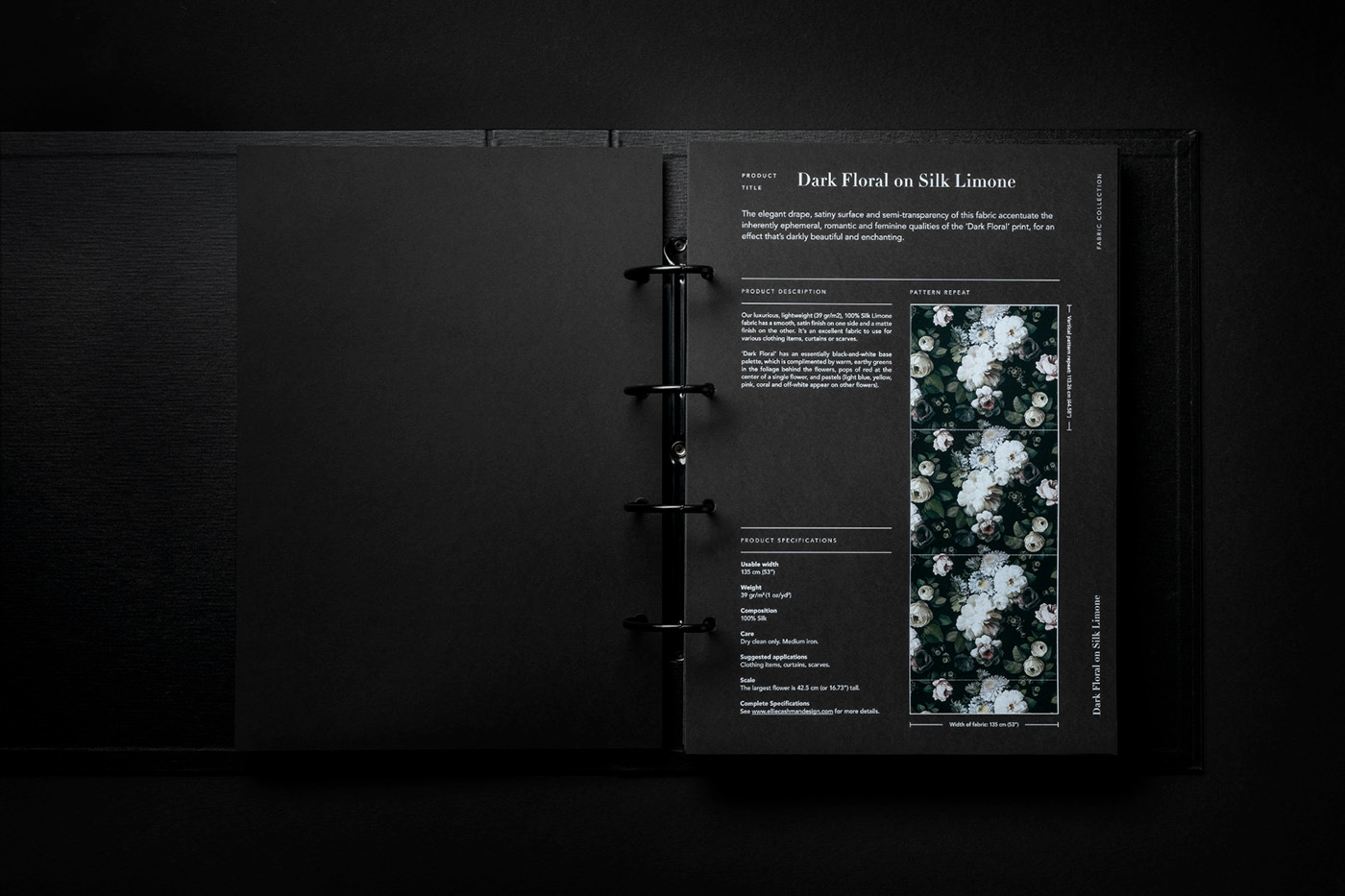
Her award winning designs are based on original drawings and paintings inspired by the still life painters of the Dutch Golden Age. To create these large-scale works, Ellie uses a combination of traditional and digital media. She develops the drawings and paintings over the course of months, sometimes years. Her designs celebrates nature in the peak of its glory. As they emerge out of the darkness and into the light, flowers provide us with powerful symbols of our common human longing for transcendence, the moment we are closest to enlightenment. Or whatever one might call it.
From the beginning it was clear to us that this tangible approach would form the core of the new identity.
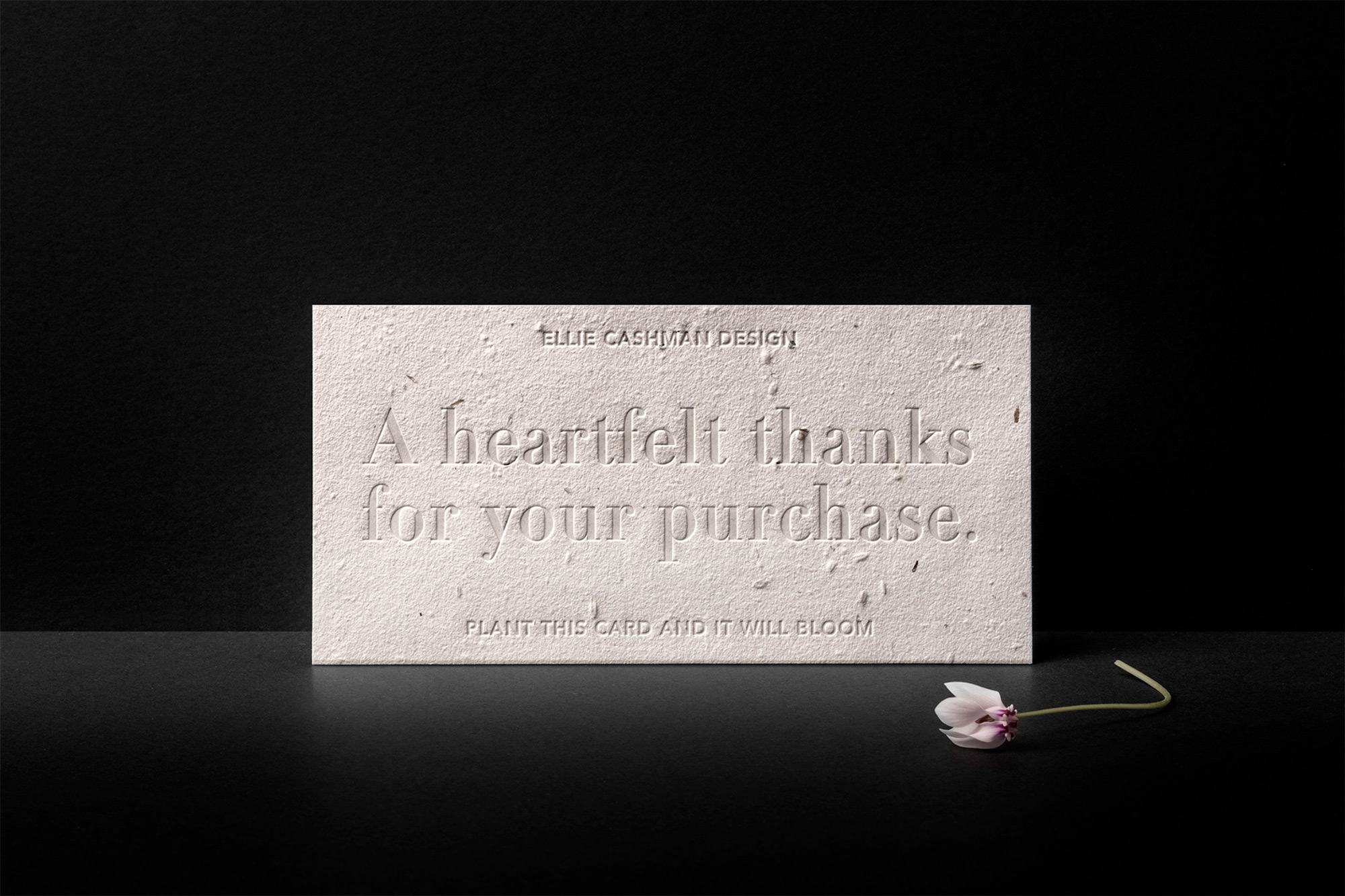
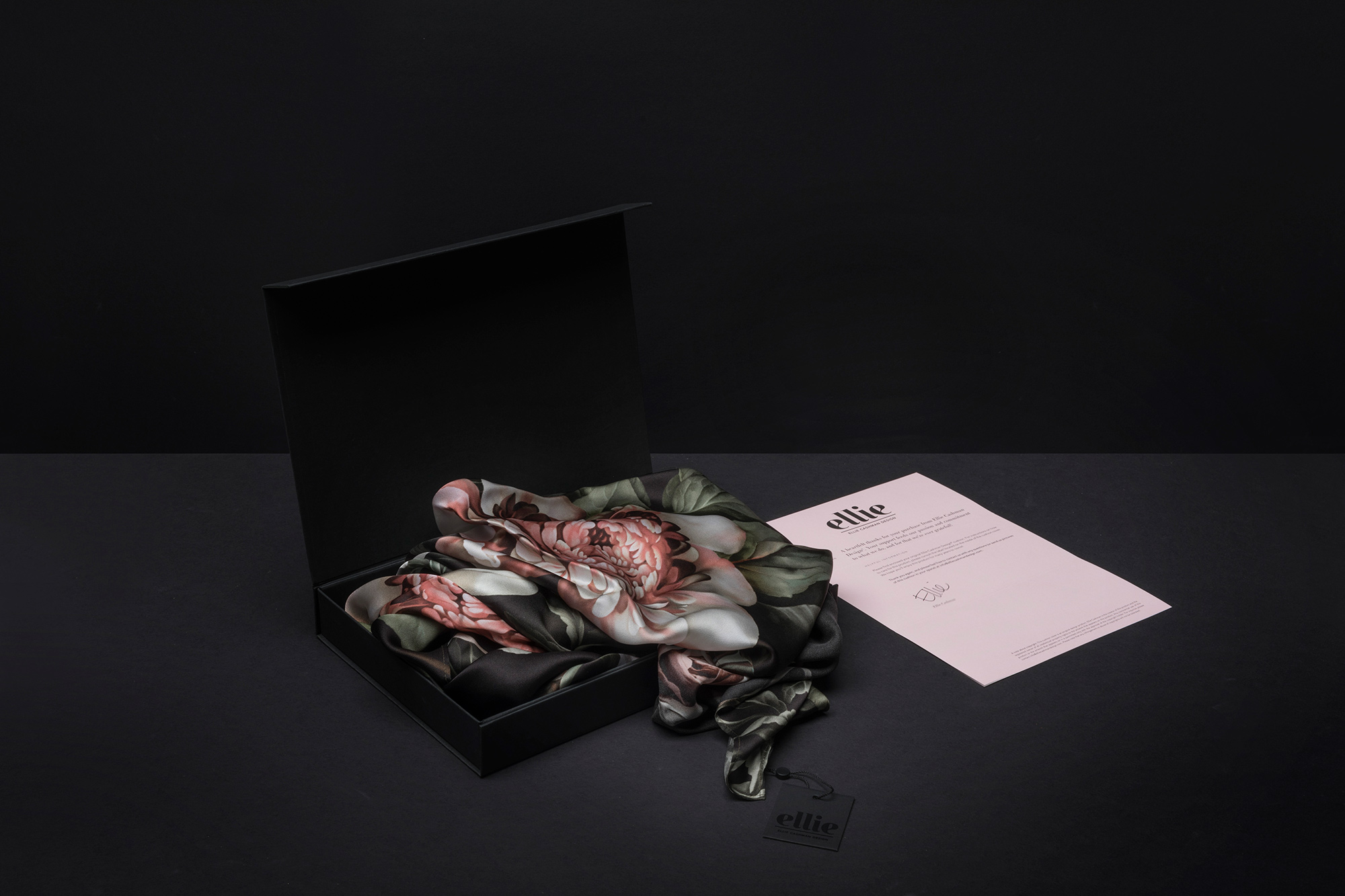
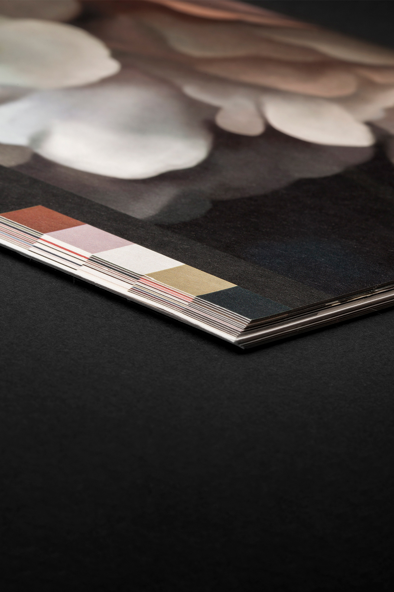
The whole stationery as well as the packaging are made of fully recycled paper and cotton. It is printed with 100% ecological water based ink. Just like the wallpaper and fabrics by the way. Handling samples is done by people with a distance to the labor market. They are offered a working perspective.
The new identity received international recognition on many design blogs and online magazines. and was showcased in the curated page of Behance Gallery. PaperSpecs made an inspiration video and the logo is included in the international publication Los Logos 8 by Gestalten.
Being an American artist living in the Netherlands Ellie serves both markets. Today her designs can be found all over the world in the form of wallpapers, cushions, all kinds of fabrics and scarfs. Our challenge lies in how to create a clear identity that represents the brand globally.
Her award winning designs are based on original drawings and paintings inspired by the still life painters of the Dutch Golden Age. To create these large-scale works, Ellie uses a combination of traditional and digital media. She develops the drawings and paintings over the course of months, sometimes years. Her designs celebrates nature in the peak of its glory. As they emerge out of the darkness and into the light, flowers provide us with powerful symbols of our common human longing for transcendence, the moment we are closest to enlightenment. Or whatever one might call it.
From the beginning it was clear to us that this tangible approach would form the core of the new identity.
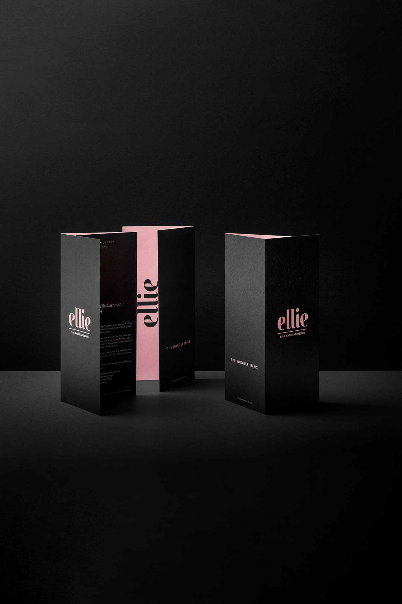
Together with Ellie’s team we decided on the brand strategy. Which formed the foundation for all of the deliverables of the identity and packaging. As for the new website as well. The new identity is personal, feminine and clear cut. A black and pink colour palette emphasises all states of painted flowers, from dark to light, from seed to stalk to bud to full, extravagant bloom. The whole stationery as well as the packaging are made of fully recycled paper and cotton. It is printed with 100% ecological water based ink. Just like the wallpaper and fabrics by the way. Handling samples is done by people with a distance to the labor market. They are offered a working perspective.
The new identity received international recognition on many design blogs and online magazines. and was showcased in the curated page of Behance Gallery. PaperSpecs made an inspiration video and the logo is included in the international publication Los Logos 8 by Gestalten.
Being an American artist living in the Netherlands Ellie serves both markets. Today her designs can be found all over the world in the form of wallpapers, cushions, all kinds of fabrics and scarfs. Our challenge lies in how to create a clear identity that represents the brand globally.
Her award winning designs are based on original drawings and paintings inspired by the still life painters of the Dutch Golden Age. To create these large-scale works, Ellie uses a combination of traditional and digital media. She develops the drawings and paintings over the course of months, sometimes years. Her designs celebrates nature in the peak of its glory. As they emerge out of the darkness and into the light, flowers provide us with powerful symbols of our common human longing for transcendence, the moment we are closest to enlightenment. Or whatever one might call it.
From the beginning it was clear to us that this tangible approach would form the core of the new identity.
Together with Ellie’s team we decided on the brand strategy. Which formed the foundation for all of the deliverables of the identity and packaging. As for the new website as well. The new identity is personal, feminine and clear cut. A black and pink colour palette emphasises all states of painted flowers, from dark to light, from seed to stalk to bud to full, extravagant bloom. The whole stationery as well as the packaging are made of fully recycled paper and cotton. It is printed with 100% ecological water based ink. Just like the wallpaper and fabrics by the way. Handling samples is done by people with a distance to the labor market. They are offered a working perspective.
The new identity received international recognition on many design blogs and online magazines. and was showcased in the curated page of Behance Gallery. PaperSpecs made an inspiration video and the logo is included in the international publication Los Logos 8 by Gestalten.
Being an American artist living in the Netherlands Ellie serves both markets. Today her designs can be found all over the world in the form of wallpapers, cushions, all kinds of fabrics and scarfs. Our challenge lies in how to create a clear identity that represents the brand globally.
Her award winning designs are based on original drawings and paintings inspired by the still life painters of the Dutch Golden Age. To create these large-scale works, Ellie uses a combination of traditional and digital media.
She develops the drawings and paintings over the course of months, sometimes years. Her designs celebrates nature in the peak of its glory. As they emerge out of the darkness and into the light, flowers provide us with powerful symbols of our common human longing for transcendence, the moment we are closest to enlightenment. Or whatever one might call it.
From the beginning it was clear to us that this tangible approach would form the core of the new identity.
Together with Ellie’s team we decided on the brand strategy. Which formed the foundation for all of the deliverables of the identity and packaging. As for the new website as well. The new identity is personal, feminine and clear cut. A black and pink colour palette emphasises all states of painted flowers, from dark to light, from seed to stalk to bud to full, extravagant bloom. The whole stationery as well as the packaging are made of fully recycled paper and cotton. It is printed with 100% ecological water based ink.
Just like the wallpaper and fabrics by the way. Handling samples is done by people with a distance to the labor market. They are offered a working perspective.
The new identity received international recognition on many design blogs and online magazines. and was showcased in the curated page of Behance Gallery. PaperSpecs made an inspiration video and the logo is included in the international publication Los Logos 8 by Gestalten.
Client: Ellie Cashman Design
Team: Mark van den Heuvel, Stephan Lerou
Awards: First Price Antalis Creative Competition
The sample books have been awarded first price in the Antalis Creative Competition.
The sample books have been awarded first price in the Antalis Creative Competition 2020.
The wonder in us
Behance • LinkedIn • Instagram