The Willem II Fabriek is a cultural hotspot located in a former cigar factory. The monumental building accommodates over 30 artists, designers, illustrators, architects and filmmakers. There’s also a restaurant, a bar, a graphic workplace, a venue and 2 exhibition spaces. Stimulating cross-over collaborations between different art disciplines, the Willem II Fabriek also functions as a cultural meeting place.
We were asked to design a framework in which all residents would be able to present themselves as independent organisations and also display the collective mindset. The concept is built upon the foundation that the Willem II Fabriek features a versatile environment which encourages new encounters and facilitates new collaborations.
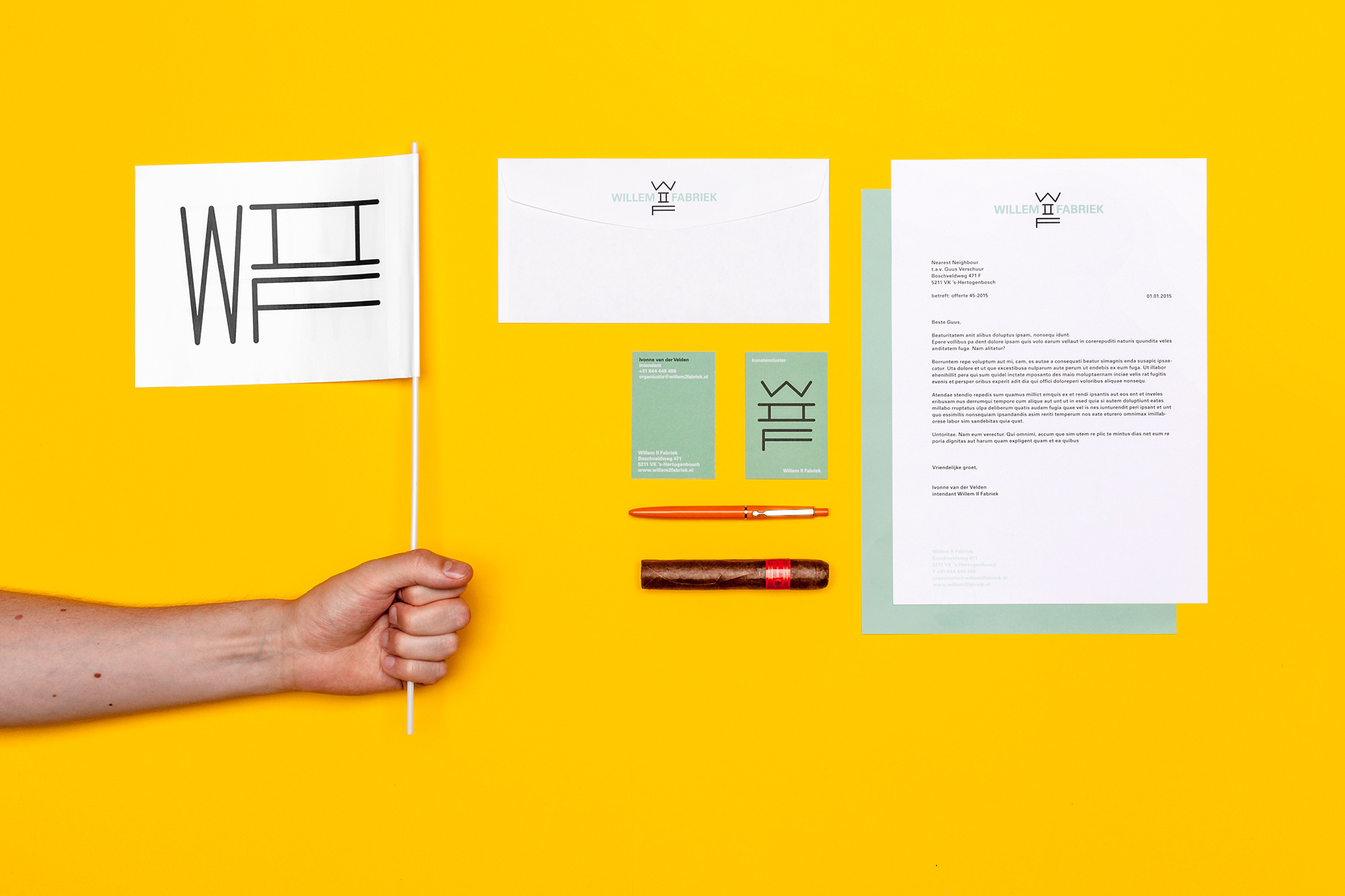
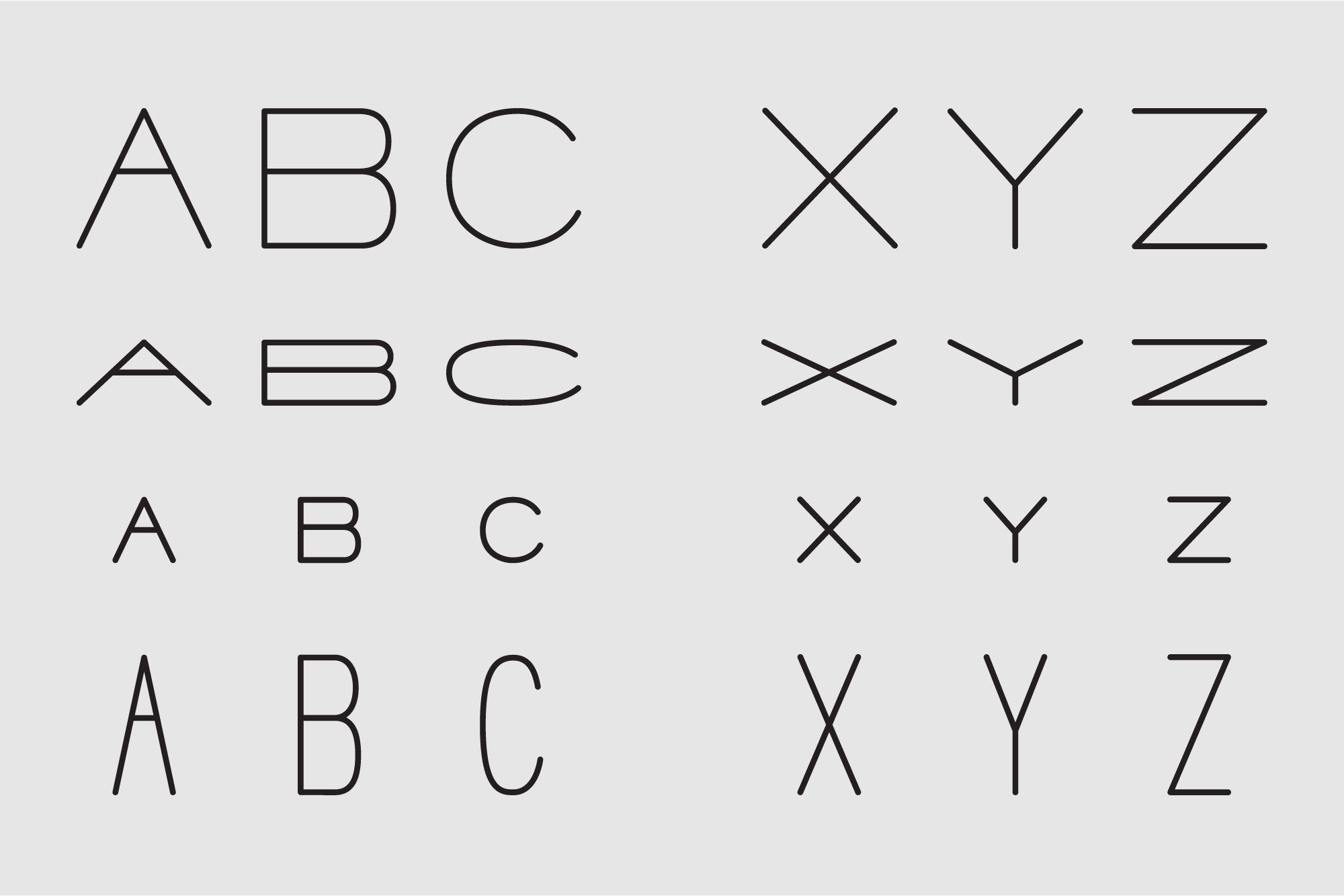
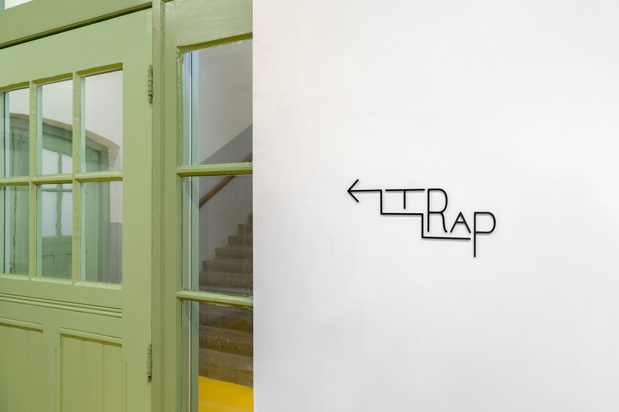
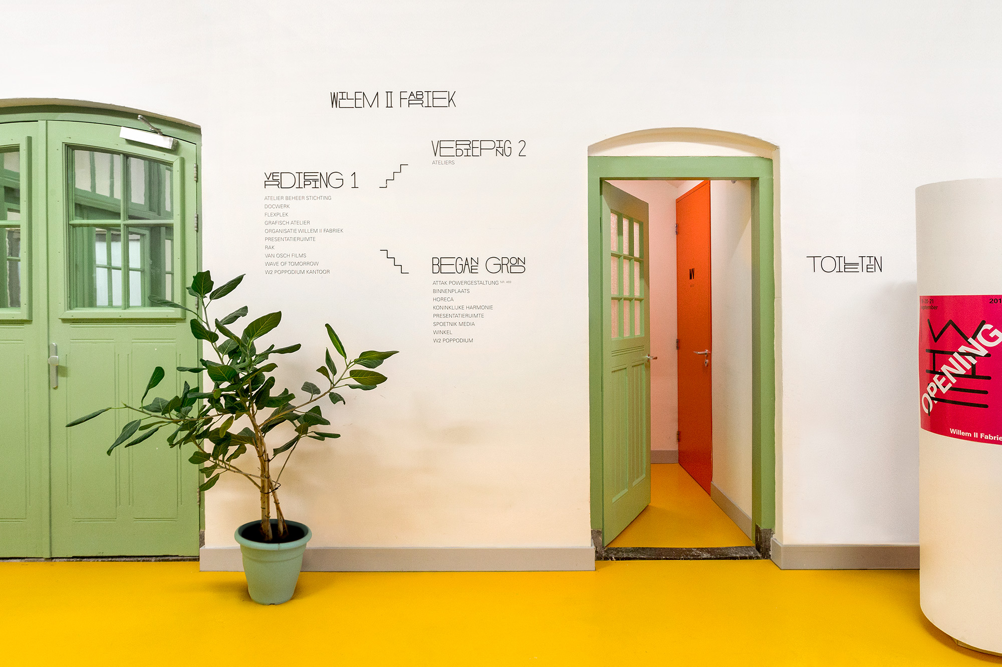
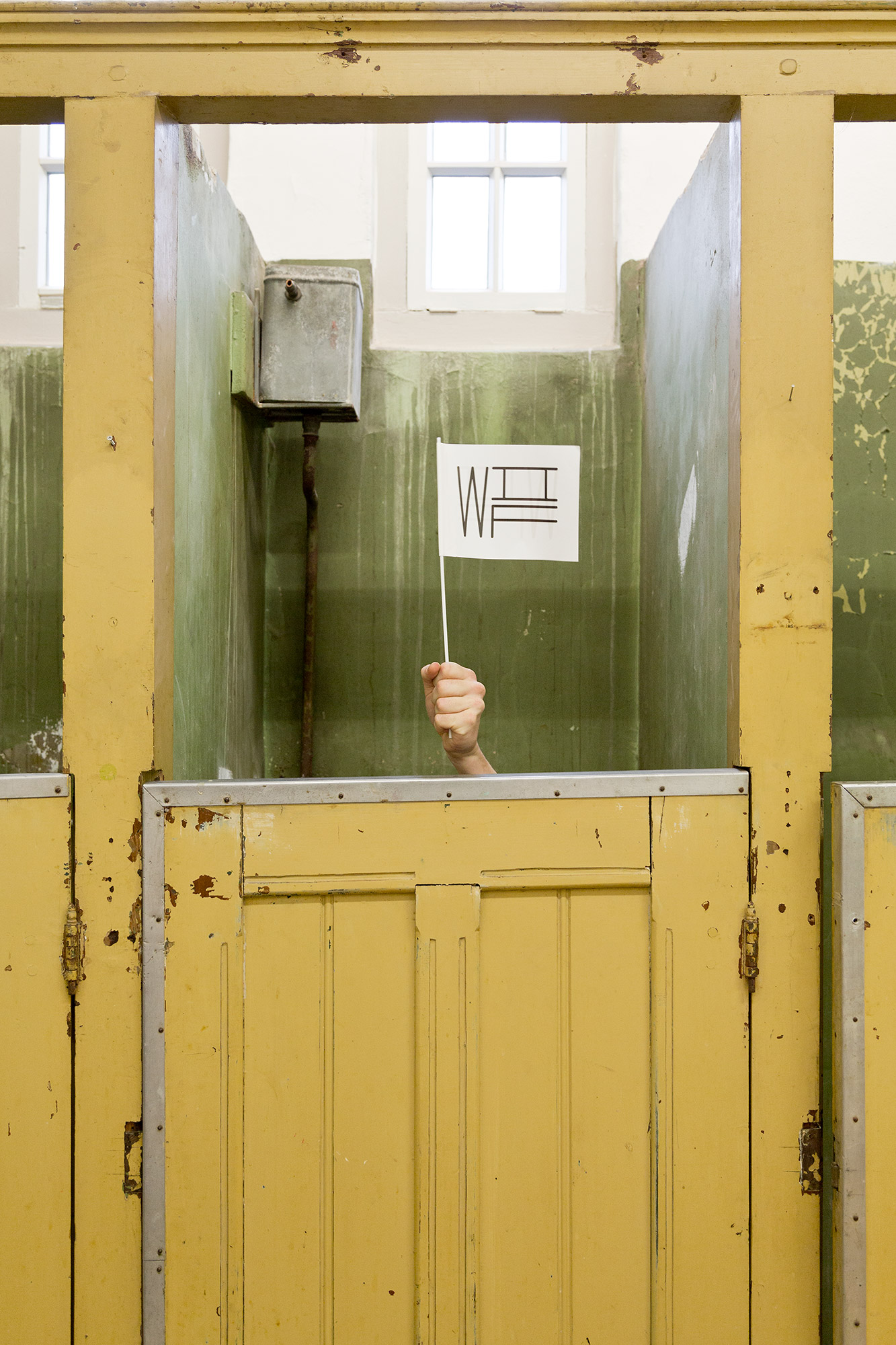
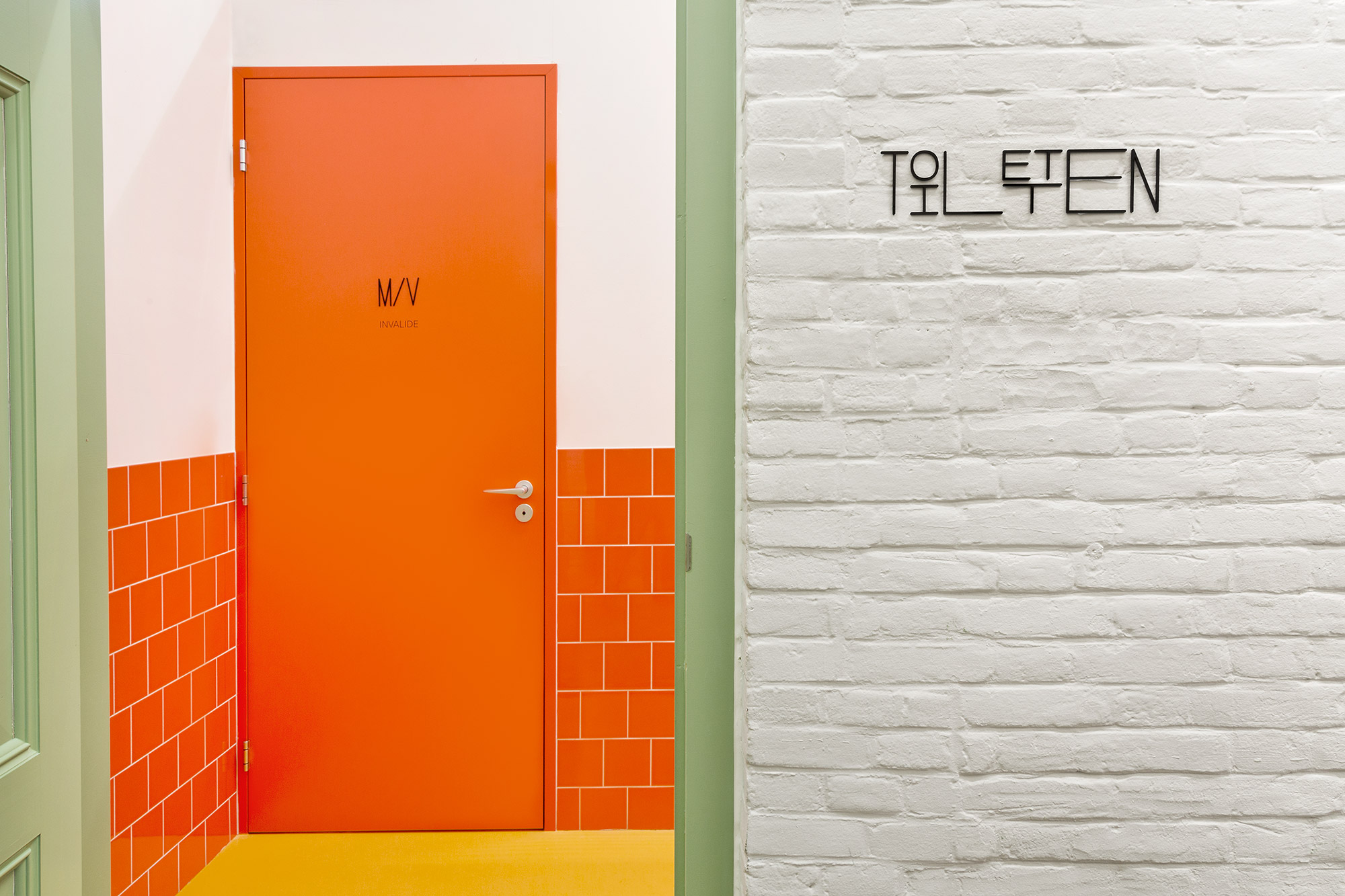
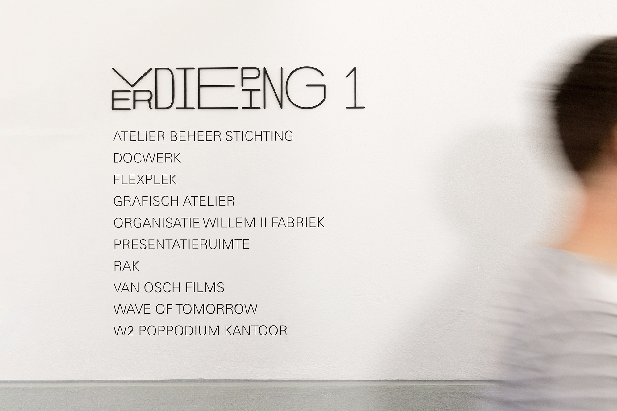
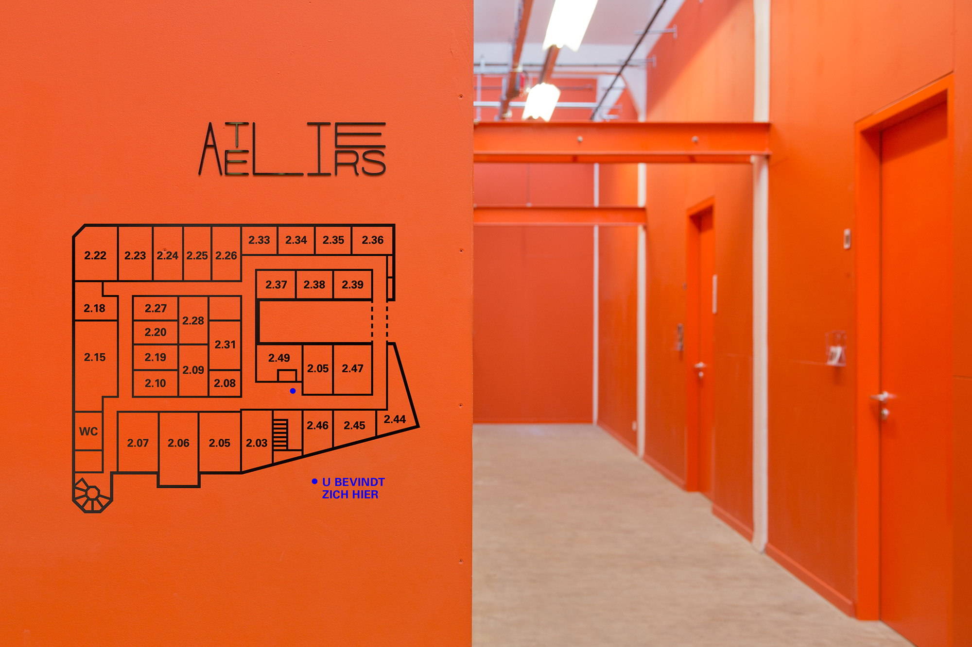
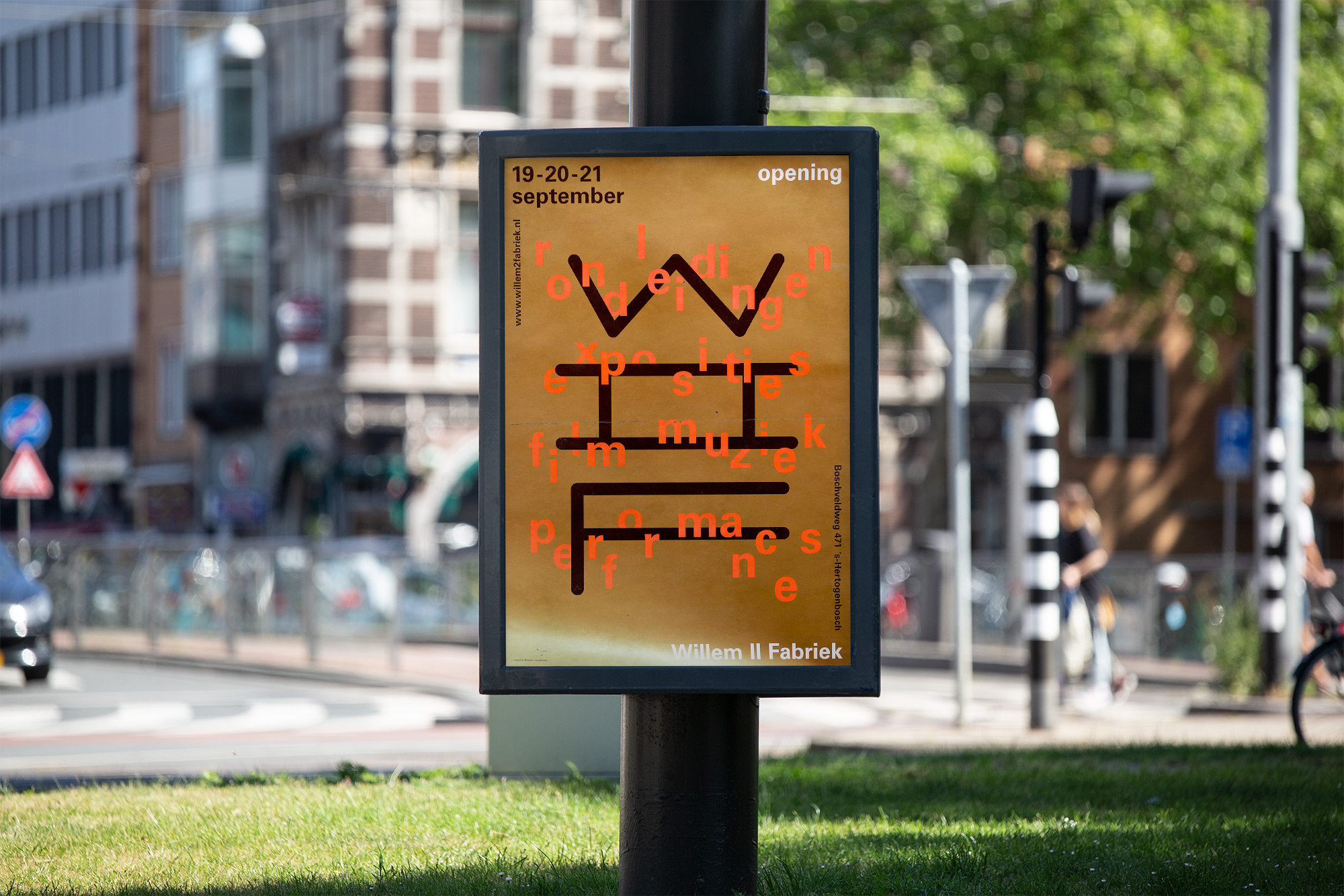
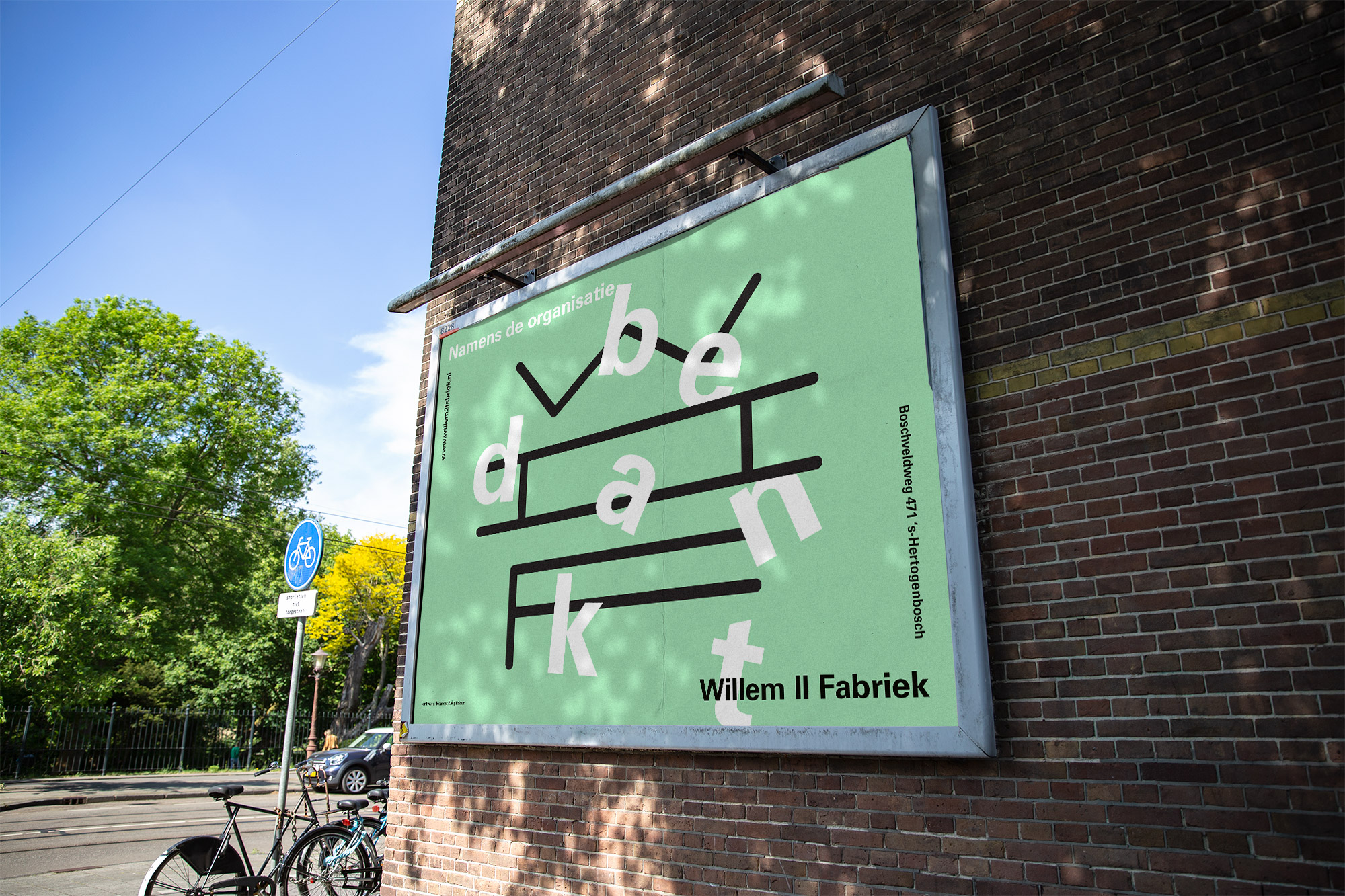
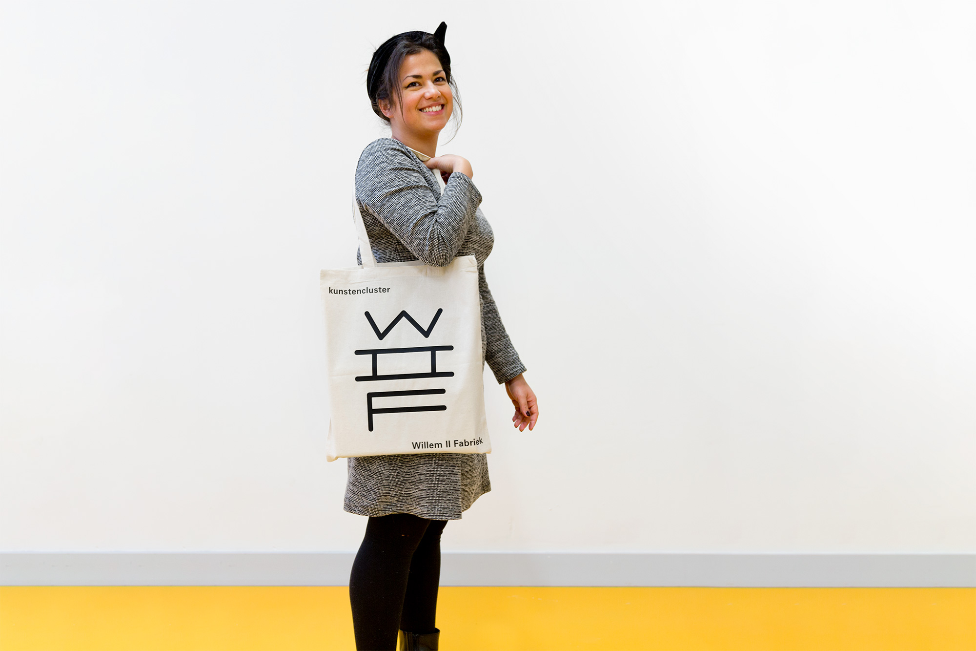
We designed a modular font-system that features 4 weights. Each of the variables is based upon the grid of the exterior of the historical building and can used as required. Resulting in a dynamic identity, adaptable to the need of appliance and expression instead of a static logotype.
We were asked to design a framework in which all residents would be able to present themselves as independent organisations and also display the collective mindset. The concept is built upon the foundation that the Willem II Fabriek features a versatile environment which encourages new encounters and facilitates new collaborations.
We designed a modular font-system that features 4 weights. Each of the variables is based upon the grid of the exterior of the historical building and can used as required. Resulting in a dynamic identity, adaptable to the need of appliance and expression instead of a static logotype.
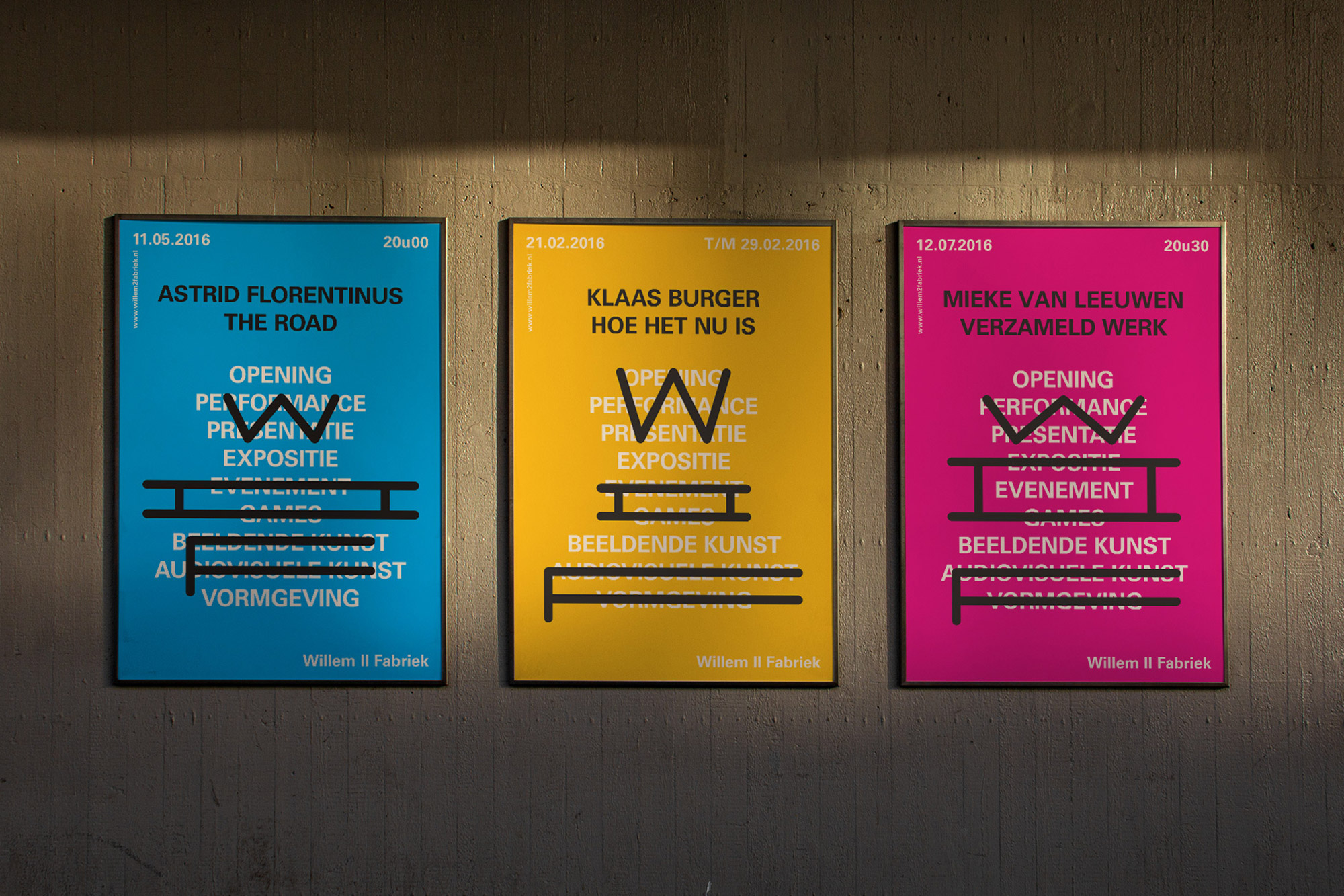
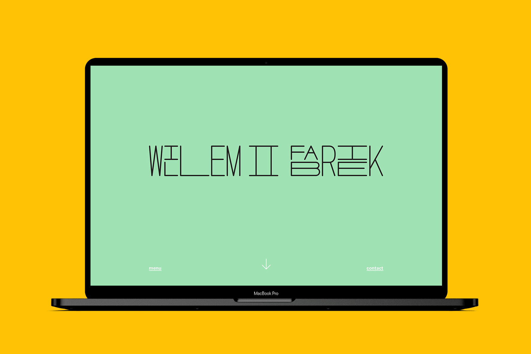
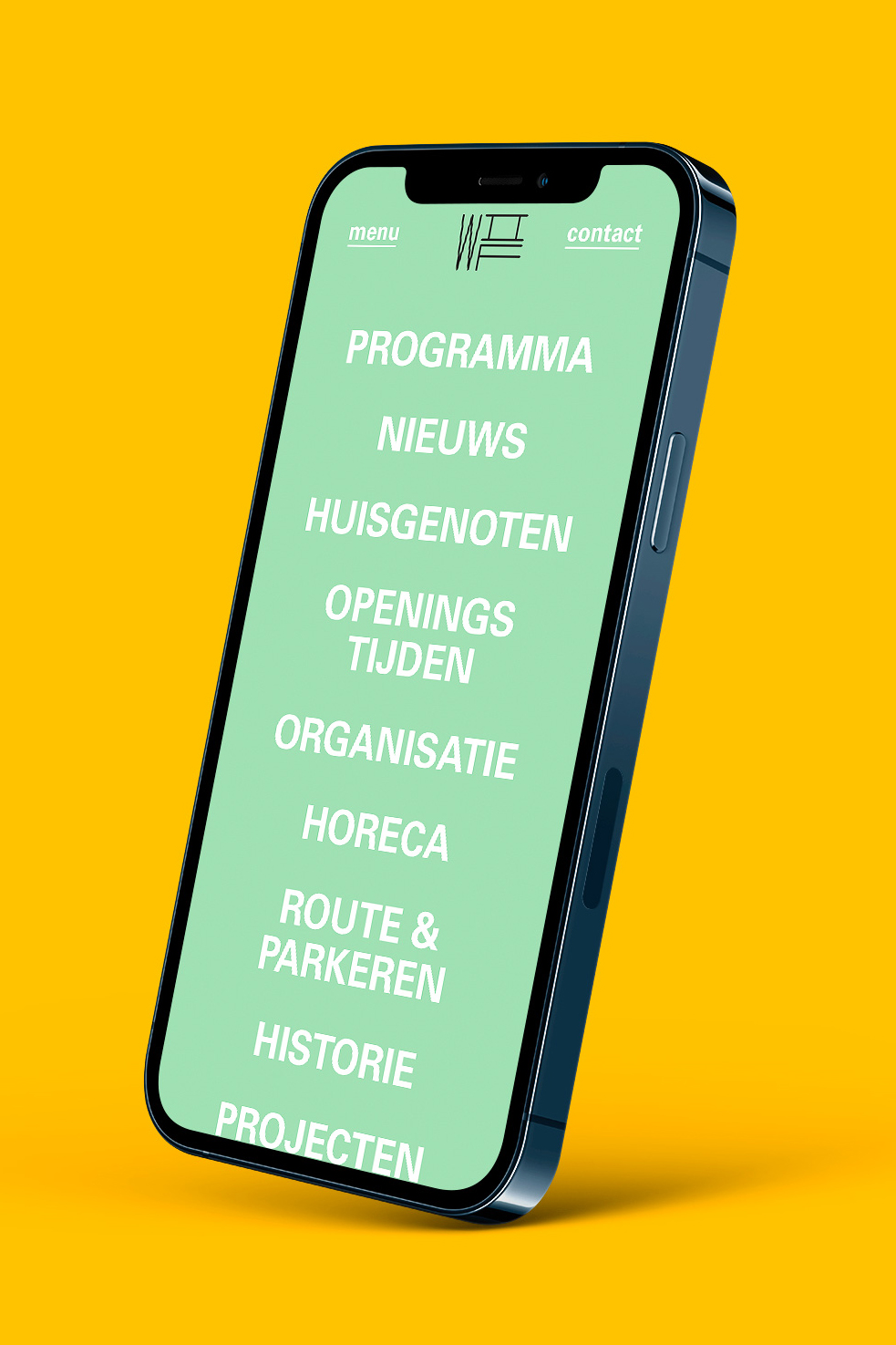
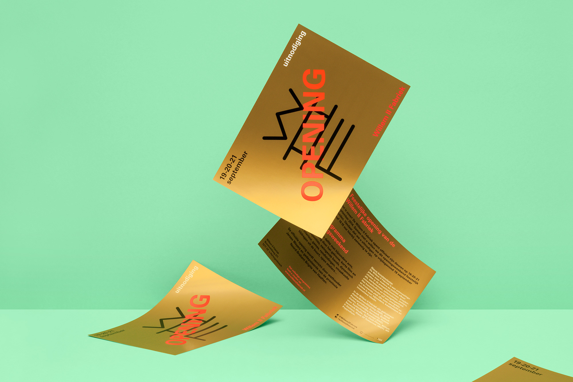
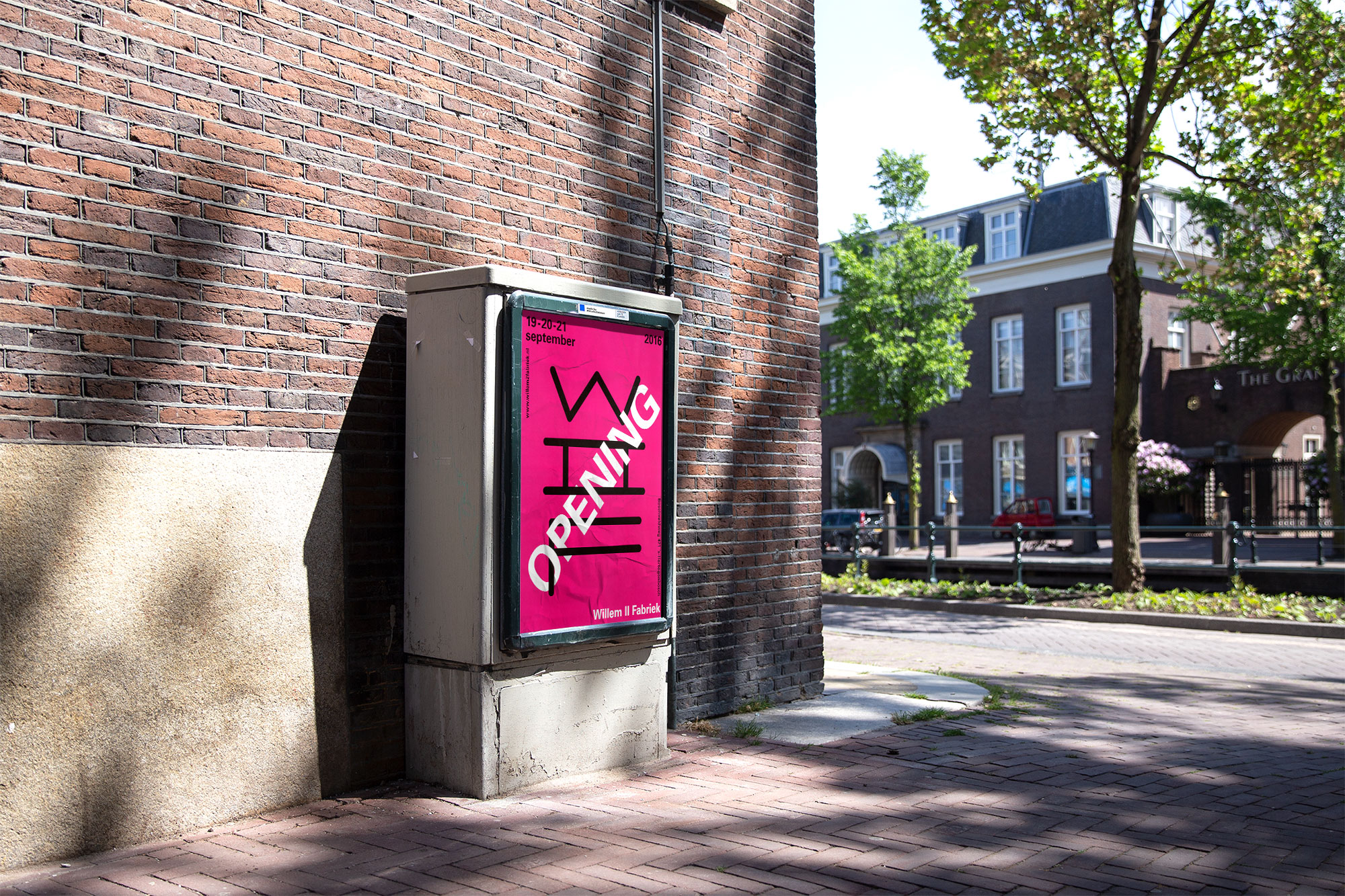
The way the font is displayed symbolises the use of shared space. The colour palette refers to the interior: the green architecture reminds of old industrial times while the orange and yellow used in the renovation of the building, illustrates the new fulfilment. As soon as the identity and website launched our focussed was on the campaign to herald the grand opening weekend. During which neighbours and residents could visit and enjoy exhibitions, food, movies and masterclasses.
The way the font is displayed symbolises the use of shared space. The colour palette refers to the interior: the green architecture reminds of old industrial times while the orange and yellow used in the renovation of the building, illustrates the new fulfilment.
As soon as the identity and website launched our focussed was on the campaign to herald the grand opening weekend. During which neighbours and residents could visit and enjoy exhibitions, food, movies and masterclasses.
Client: Willem II Fabriek
Partner: Mark van den Heuvel
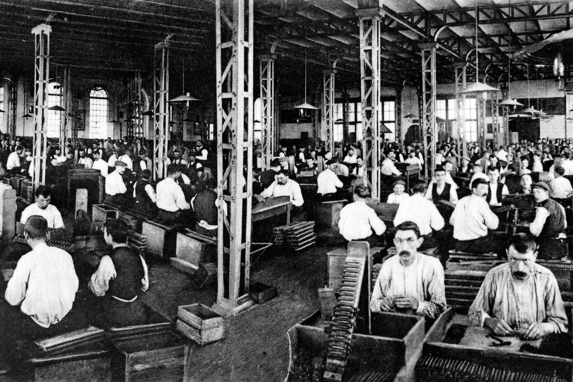
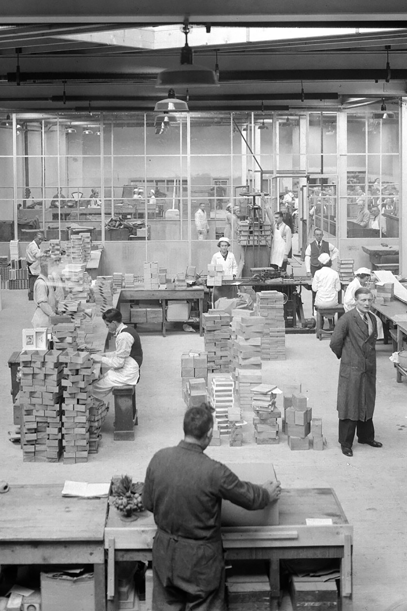
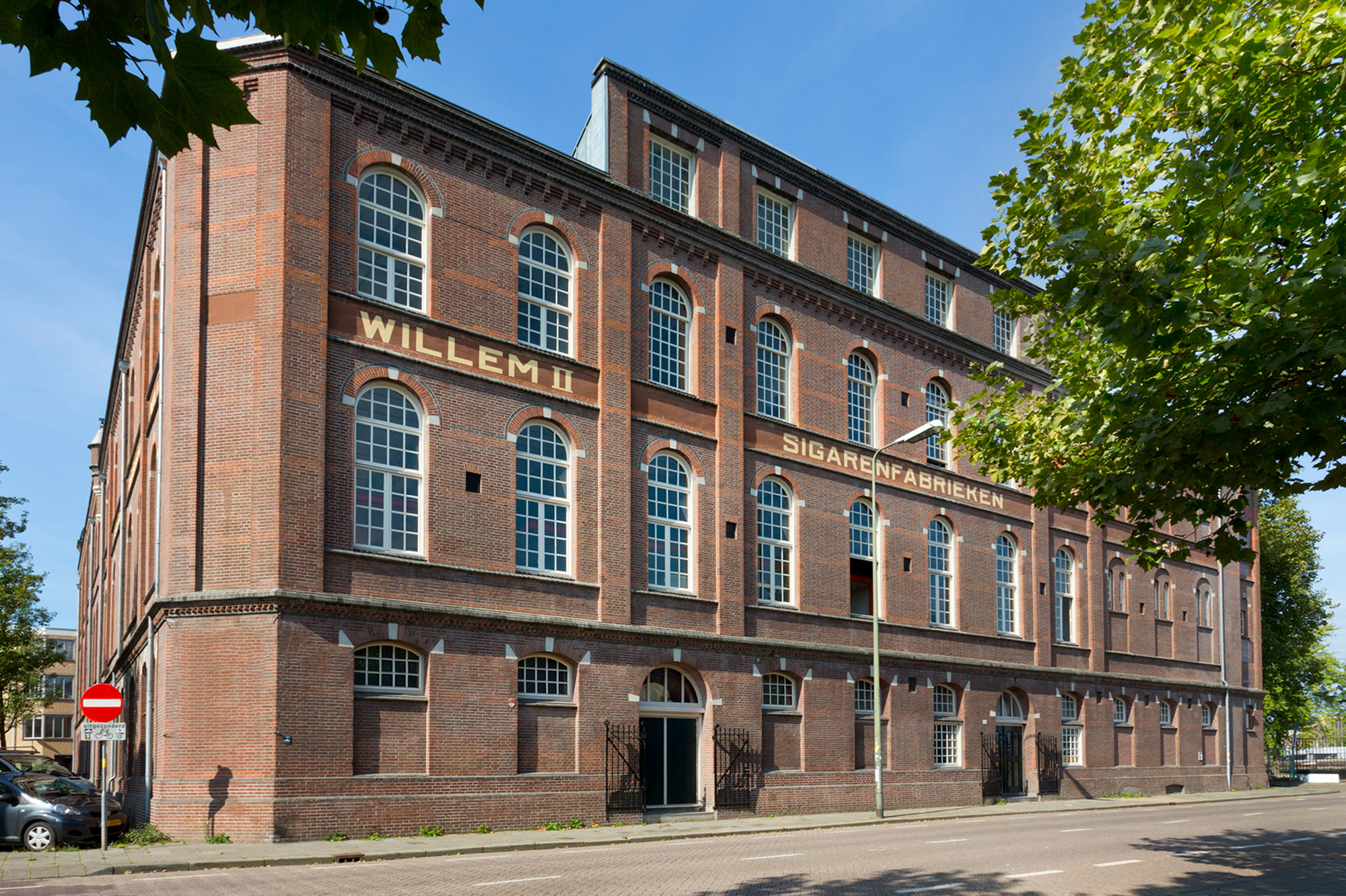
Culture in a former cigar factory
A cultural factory
Behance • LinkedIn • Instagram